Green Ghouls – Creating Horror With a Game Boy Style
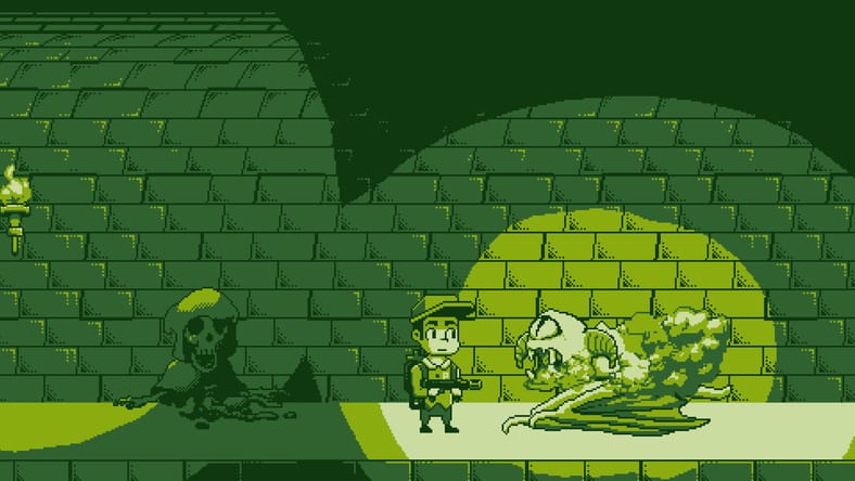
“I wanted something stylish, but also sort of grim-looking. The old acid-green pallor of the Game Boy screen always looked slightly-otherworldly somehow, in an interesting way. I feel it helped create an atmosphere with no color, no warmth, and no hope!” said Mitchell Hall, developer of the Game Boy-inspired Mouth Sweet.
The Game Boy, filled with titles like Kirby’s Dream Land, Super Mario Land, and Tetris, wasn’t exactly a console known for its ability to inspire fear (well, expect for Pokémon’s Lavender Town, I guess). The green visuals, which you could only really see with a lamp sitting somewhere close by, seemed to better loan themselves to oversized cute creatures due to the limitations of the screen size.
Not that horror can’t be done with these visuals. An array of talented developers have been using this unique visual/audio style in their horror games, capturing a strange, otherworldly feeling with the system’s emerald hues. Given the clear limitations in color and visuals, what would draw a developer to work with this style, though? Why purposely hamstring your game’s appearance in this way? I wanted to know, so I reached out to six different developers who’d created Game Boy horror games to find out what prompted them to choose the style and how they felt it enhanced the fear they wanted to create.
For Ryan Collinson, developer of Lasagna Boy, part of the draw was the lack of horror games created for the system or its style. “I saw a clip of some of Lumpy Touch’s Game Boy horror animations. That was where I first got the itch to create a horror game in this style. I couldn’t think of any games for the Game Boy that were focused on being a horror game (I think there are a few that exist), so I thought it would be a unique game to create. I think Lumpy’s animations may have inspired a whole wave of Game Boy horror games from not just me, but also other developers.”
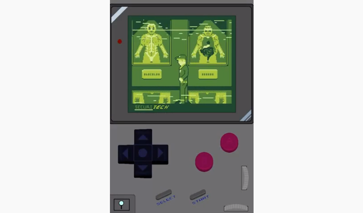
“Growing up, I loved playing my Game Boy, and I also really enjoyed horror,” said Scottie Supple, developer of The Third Shift. “There were never really many attempts at horror on the system at the time, so I figured I’d give it a try, as it was something I really wanted myself. I came up with the concept for The Third Shift as this “live footage,” security camera-style horror game since the cameras themselves were lacking in a plethora of colors. Also, drawing from pixelated horror games like Clock Tower and The Uninvited really helped shape the game to be the way it is now.”
“Not long after Chris Maltby came out with his GB Studio Engine, me and a few devs I worked with at the time jumped on it pretty much on launch. We set ourselves up with a game jam and went to town seeing what we could do with it,” said Adam Birch, developer of Deadeus.
“At the time, the engine was limited to a top-down RPG-ish style like you see in Deadeus. Then, it came down to working out a short story for it. I realized after doing a bit of research that there weren’t really any horror games out there for it; there were Halloween-y, horror-y themed games, but not many, if any, specifically geared to that sort of thing. After finding that out, I went flat-out on it. I loved the idea of trying to get under peoples’ skin on such a simple medium,” he continued.
Many developers looked to the Game Boy as a challenge in making horror. It would be difficult to create fear on a console so known for simple, unassuming characters and cheerful sprites. As they started to work with the visual style, they started to pick up on some of the interesting ways they could unnerve the player with it.
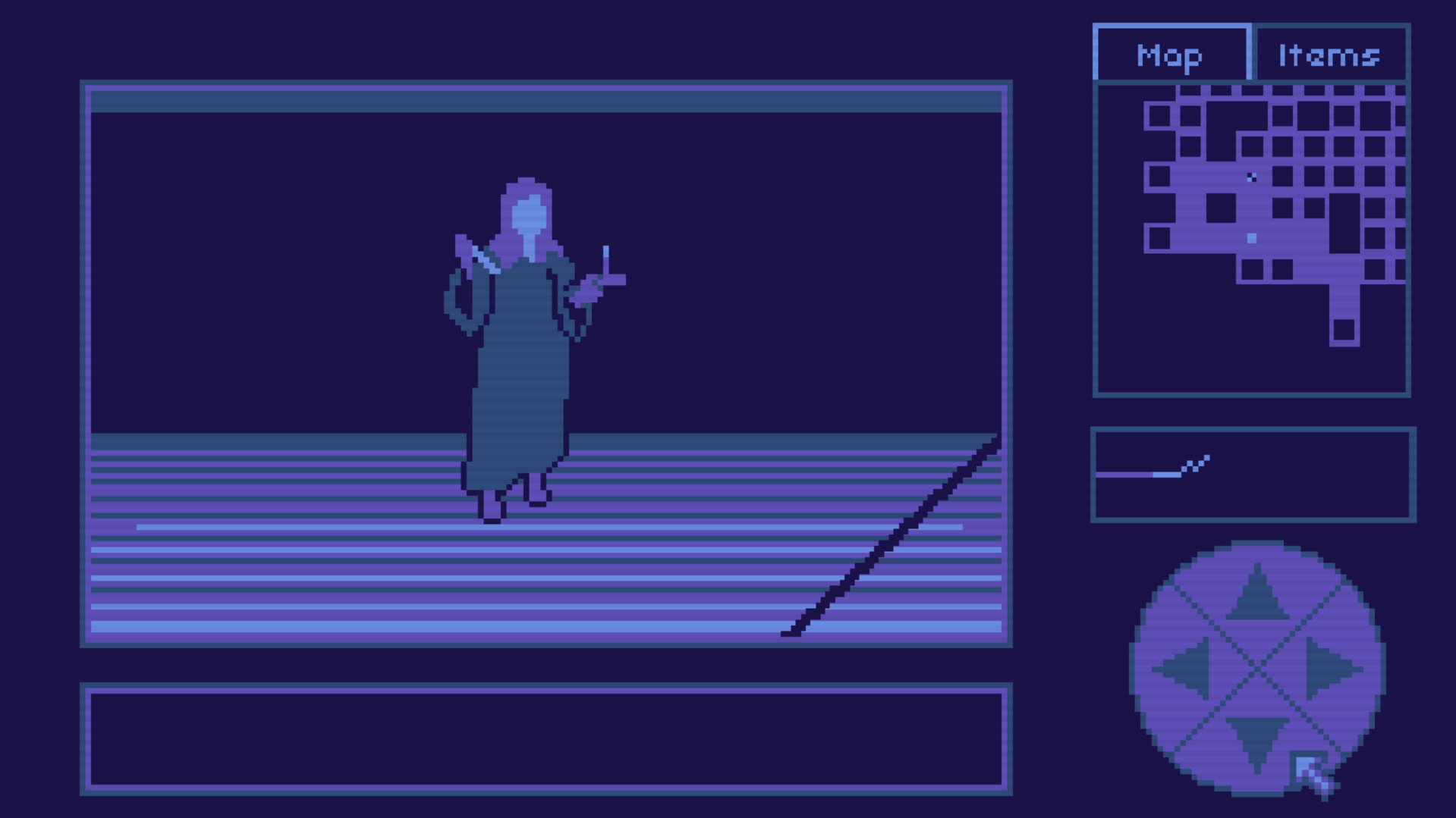
The natural limitations of the Game Boy forced the developers to leave room for interpretation when creating things in this visual style, but this encouraged players to fill in the gaps to horrifying effect. “Because the visuals are really simple/basic, you can use your own imagination to fill in the gaps,” said Ignacio Maldonado, developer of The Enigma of Salazar House. “For instance, when you see a monster in a game like this, you can think details like black dots are scars, open holes, or even something more disgusting. I feel that the player’s imagination enhances things far more than they might think.”
“A lot of what makes effective horror is obscuring and abstracting what you’re seeing,” said Hall. “This is getting harder and harder to do when there’s more and more pressure for things to constantly be clearer, crisper, and HD-er. Going retro is a good way to do this, all while looking like you’re doing it on purpose.”
Darius Immanuel Guerrero, developer of HopBound, had similar feelings. “The limited colors and pixel art makes it hard to fully imagine what the horrors in the game actually look like. This may be a clichéd statement, but it’s true: the mind fills in the blanks, and imagination scares you even more. Game Boy palettes combined with pixel art create ambiguity, which fuels our first and most primal fear: the fear of the unknown.”
Guerrero also felt the visual style could take our minds to a frightening place in our pasts, which they use throughout HopBound’s journey through an unsettling retro game. “Anything that evokes that nostalgia feel has always been effective in horror games. You see typewriters, tape recorders, old cameras, and the like in AAA titles. Indie games like ours get to use it even better. Why do they work? Perhaps they take us to a time when we were younger and more vulnerable. Perhaps they take us to a place where we’re not safe behind dependable modern technology, and it makes us feel uneasy.”
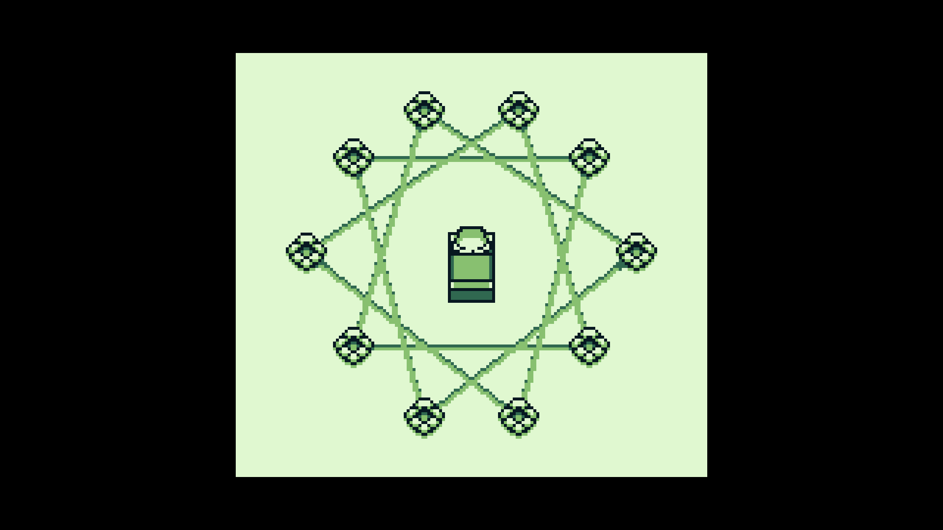
Birch mentioned that, in an age of online horror stories, the visual style naturally draws up imagery from other unsettling media. “I think the internet itself has been such a benefit to the medium too. Everything to do with creepypastas and haunted cartridges plays right into our hands. I think that was a contributing factor, too.”
Maldonado felt that the childhood connections to the system’s style enhanced that feeling of unease these works created. “The Game Boy style is really associated with ‘kid-friendly,’ so when you see something that you shouldn’t see, or when you see something weird in a style like that, your mind begins to wonder what this horrifying thing you’re trying to see actually is.”
Maldonado also felt that a creator with a steady hand could make some good horror out of almost anything, as well. “This visual style is a great fit for horror. Well, in my point of view, almost all styles are compatible with horror. As long as the creator knows how to make a great atmosphere within the game, any type of game could be a good fit. If edutainment horror games exist, it makes you wonder what visual style can’t be a good fit for horror.”
While the Game Boy style could be used to create some chilling visuals, the audio was equally important in this mission to unsettle the player. “There’s something inherently creepy about unsettling Game Boy music in a classic, creepypasta way…” said Birch.
“Using some compressed SFX makes you wonder… ‘What kind of stuff would make a sound like that?’ Regarding its enhancement for The Enigma of Salazar House‘s story, I wanted the players to put the story together. So, if the visuals/audio don’t do their job in making the player think and imagine, their curiosity would be lost and their interest would be gone,” said Maldonado.
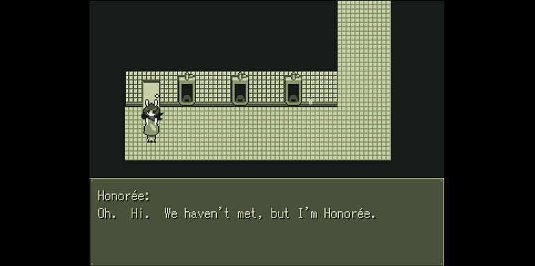
While these Game Boy horror works have ended up quite chilling and scary despite, and often because of, the limitations of the system, that doesn’t mean that it was easy for the developers to get to this point.
“For the visual side, there is an upside and a downside for creating a game in this style. The color palette is limited to only four gray scale colors, which can be a good thing and a bad thing. With less colors to work with its easier to develop the art since there are less options to choose from, but when it comes to other aspects of the game, sometimes it would be better to have a wider variety of colors to work with,” said Collinson.
“At the beginning of the development, I really struggled with creating horrors in this visual style,” said Maldonado. “In my case, in the beginning, because of my pixel art and the game’s low resolution, it didn’t look particularly scary… All of my ‘monsters’ had a previous version of them, they were really cartoony, and I didn’t think they would scare anybody. That’s when I thought about Airdorf’s Faith and remembered the Rotoscope animations that game has. So, I did some animation tests and they became really great, and because of that, it made my simple pixel art a lot more horrifying. Having something really scary, even if it’s in a visual style like this, elevates all the game’s horror value.”
“It’s kind of hard to make something scary while also making it blocky and cute. I tried to work around it by making the monsters mostly-invisible. I hope it worked! I don’t honestly know if Mouth Sweet is scary or not – since I can see all the puppet screens, it’s not scary to me,“ said Hall.
For some developers, getting around these issues involved bending the rules of the system a little bit. They created a look and sound that skewed quite similar, but with its own differences that gave them some more breathing room. It’s not always about doing things exactly like they had been done before.”
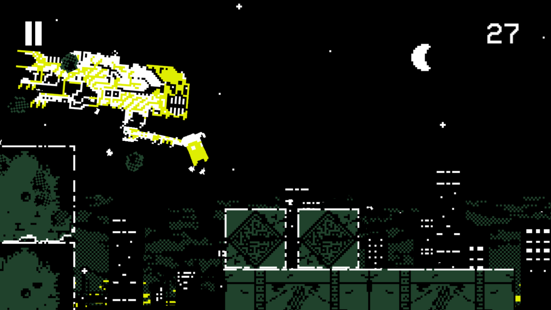
“Our composer, Julian Crowhurst, said: the trickiest part is trying to find the balance between what can realistically be achieved on a Game Boy versus pushing the boundaries for the sake of world building and player immersion. We always want things to look and sound as much like an original Game Boy game as possible, but always prioritize the experience if it means going outside of the device’s capabilities. How that boundary is defined has changed over the course of development,” said Supple.
“I’d say working with the limitations of the small screen size, along with the 4 colors, has helped me grow as a game developer in conveying what I want within a game. While we limit ourselves in certain areas, we also tend to go above what the Game Boy was capable of. But with that said, we still try our best to maintain the “Game Boy” feel. We jokingly play this off by saying that, when you play The Third Shift, you’re actually playing on a “Lame Boy” system. Or that the game comes on multiple cartridges,” he continued.
“I think one of the ways of creating good scares or horror is going to be just creating good art and animation,” said Collinson. “Even though a Game Boy game is going to be limited in color and size, there is still quite a bit of room for different art styles. For my game, I am cheating a bit by not having the same screen size as a Game Boy’s screen, but this gives me more screen to work with and lets me make larger, more complex characters. Also, I think using darkness is going to be key in creating suspense and fear,” said Collinson.
“For the audio, I don’t always use audio that could be made by a Game Boy, but I try to keep it simple and as close as I can get to something that would be made by a Game Boy. I think limiting a game’s sounds to only those that can be made by a Game Boy would have similar benefits and disadvantages as limiting a game’s color palette,” he continued.
Guerrero took these alterations of the Game Boy formula and even worked them into making HopBound more frightening, playing with player expectation. “There’s a sort of uncanny valley effect going on with HopBound. It feels familiar because it looks like a Game Boy game, but part of our mind screams that it’s not the same. The colors are off. The music, the framerate; everything clashes with what a Game Boy game can do. Nostalgia draws you in, but closer inspection makes you realize something’s wrong with the game.”

While they may not have always made use of the Game Boy visual and audio style exactly, many developers found the system’s style was effective in created this sense of unease in being uncertain. There was something about this look that left much open to interpretation, allowing the player to fill in the gaps with their own fears.
“What past Game Boy games lacked in the visual department was made up for by the player’s own imagination, so with that said, I’ve tried to go with the ‘less is more’ approach and let players fill in the blanks themselves,” said Supple.
“As for visuals, there is such a minimalist restriction on what you can get away with on the Game Boy that it always felt like I was pushing right on the line of what could be done in some of the splash screens. With that in mind, everything had to be made to count. On the flip side, due to the simplicity of it, I think a lot of it is left up to interpretation and the writing,” said Birch.
Developers could also find some unique advantages to the style. “Creating HopBound with only four colors was very tedious to me,” said Guerrero. “I didn’t use shaders, I had to color everything manually. It was worth it. You have creatures with limited colors, on a backdrop with limited colors. Players are constantly on edge, because they realize the creatures could be walking in front of them and they just don’t see it clearly. Players have to be in high alert to avoid them, and it’s easy to create fear when players are in this mental state.”
Ambiguity and developer ingenuity would go a long ways in frightening the player with these Game Boy horror games, drawing upon childhood fears and connections, as well as our general unease with the unknown, to make something chilling and new. Each took the idea of making horror on the Game Boy, finding their own balance between perfectly copying the style or altering it to make the fear even stronger. All of them have created intriguing experiences in this style. But even if they all found that the style was good for horror, it was still the raw talent of the developer themselves that really mattered most.
“I’d say it’s a great fit, but then again anything can be a good fit for horror if you really try. It’s like that one sentence horror story: ‘The last man on earth hears a knock at the door,’” said Supple. “Horror is subjective and relies on the participants’ willingness to immerse themselves within it. But it also falls on the creator to make an immersive experience worth participating in.“
Categorized:Editorials Ultra-Indie Spotlight

