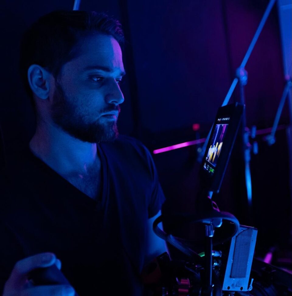
‘That’s A Wrap’ Cinematographer Marcus Friedlander Talks That Throat Scene

After releasing films such as Becky, The Wrath of Becky, Aftermath, and Fear the Night, Quiver Distribution has become known for its unique horror titles. The latest one is That’s A Wrap starring horror favorite Cerina Vincent (Cabin Fever), Monique Parent (Creeping Death), Sarah French (Pretty Boy), and Adam Bucci (Eastsiders).
In the film,
A mysterious villain from a new horror film appears at the cast’s wrap party and begins to stage their own kill scenes. One by one, the cast disappears until the true nature of the evening is revealed.
Director Marcel Walz enlisted cinematographer Marcus Friedlander to execute a specific, American Horror Story: Hotel-inspired look for the film. A look that included unsettling shot angles/movements and a Giallo color palette. In the below interview, Friedlander discusses everything from paying homage to the famous Psycho shower scene to shooting the memorable Troy throat sequence in one take.
Dread Central: How did you first become involved with That’s A Wrap?
Marcus Friedlander: I first got involved with That’s A Wrap through two different sources actually. Marcel, looking for a Director of Photography, reached out through his network, and I got recommended twice! The amazing Sarah French, who is one of the lead actors in That’s a Wrap, put my name forward for the film after we had an amazing experience working together on a film called Dawn the year before. Then, a good friend of mine that I’ve worked with for years, Brendan Petrizzo, who’s also a good friend of Marcel’s, echoed Sarah’s recommendation, and the rest is history!

DC: We heard you got inspiration for That’s A Wrap from American Horror Story: Hotel. What was it about AHS that you particularly liked so much?
MF: While American Horror Story: Hotel was a big influence on the film, it was actually something I had never seen prior to prepping the film. Marcel, the director, is a huge fan of the show, and wanted to take inspiration from the way they moved the camera, and the way they handled hallways. I only watched the season premiere before we started shooting, but I could easily see why Marcel was so in love with the look. It was so unsettling and so effective, but at the same time, didn’t draw so much attention to itself that it distracted from the characters. So we took those principles, and then applied them to the Giallo color palette, and instantly fell in love with the look!
DC: Most of the scenes in That’s A Wrap are lit by neon-type lights, whether they be green, blue, or red. Is it harder or easier to light with these extreme colors than natural light?
MF: In some ways, lighting with neon and RGB lights can be tougher, but in other ways, it’s actually easier. It’s tougher than lighting with pure daylight or tungsten-balanced lights because there are significantly more choices, and the choices are very granular, compared to the tungsten/daylight dichotomy (obviously not considering gels in this scenario).
On an RGB light, in HSI mode, for example, you have three controls (Hue, Saturation, and Intensity). Hue is described as a circle with 360 degrees, and both saturation and intensity are described in percent out of 100. This means you technically have 360x100x100= 3.6 million choices of colors to choose from per light. That amount of choice can be paralyzing if you don’t already know what you are looking for before you start fiddling with the controls.
However, lighting with RGB makes things easier because contrast is arguably the most important visual aspect of image creation, and chroma contrast just adds to the punch that Luma contrast was already creating. So if you take a perfect lighting setup, lit with just tungsten lights, and replace it with contrasting RGB’s that complement the actor’s skin tone and the colors of the production design, your image will have more “impact”, than it did before.
For a genre picture like That’s A Wrap, that level of impact is exactly what we are going for when designing the look. However, if we were doing a period piece film that took place in the desert, we probably would have little to no RGB’s because that look isn’t appropriate for the film. And that’s one of my favorite things about cinematography as an art form, it’s always reflecting the story that it’s trying to tell.
DC: The killer in the film, Mistress, is very mysterious with a long red jacket, wig, and a black face. Did you shoot that character differently in order to gain a more mystical quality around her?
MF: To really help sell Mistress as not only a killer but also a character, I worked really hard with the actor behind the mask to make sure the eyes popped out of the image as much as possible. This involved a series of different tricks, but something that I picked up early on, was that it was better to light the mask, and the eyes behind the mask, as separate elements. That, combined with very specific body, chin, and eye positions, helped to make the killer’s eyes jump out of their face! Mistress also has a lovely blonde wig on that caught our RGB lights beautifully, so we were able to use it as a sort of “mood ring” for where Mistress was at any point of time in the story.
DC: There is a very memorable scene with the character of Troy and a lot of blood in a white room. Did you all have one shot at filming that scene? What sort of prep went in to make sure that scene went off as planned?
MF: Without getting into too much of spoiler territory, that was one of my favorite effects I’ve ever shot! We absolutely only had one shot at that effect, otherwise, it would have taken a day or two to reset the stage to 0. We rehearsed the scene several times in various stages. First, the actor, with no effects appliances on, walked the shot with Marcel and me. Then we did it again with cameras on the shoulder, then again with the effects rigged but without going off, and finally we did it for real.
Even with all that rehearsal, there’s no way to properly prepare an actor for that amount of force, but Brandon handled it like a pro, and the effects team did an amazing job! We also shot the scene with two cameras, with our A camera at 96FPS on the closeup, and the B camera on a wide at 24fps, so the post team would have flexibility in how to handle this one take effect. However, the post team did a lot of clever blends and jump cuts to make our closeup camera play as a full-oner, so we never even had to jump out to the wide safety shot at all!
DC: Which death scene was the hardest to shoot in That’s A Wrap?
MF: While the “Painting the Walls with Blood” scene was the most precarious death to shoot, the hardest death to shoot (SPOILER ALERT!!!) was probably the Psycho shower homage scene. Having such an iconic scene handed to you as a reference is very intimidating because you are walking in the footsteps of giants, so you know you have to nail it. That, plus the nudity and closed set aspect making it even tougher, led to a small, self-contained effect being much more complex to shoot than it would have first appeared.
I also had to figure out what RGB tone is appropriate for an homage to a black-and-white film, which was a hilarious oxymoron to me. Luckily, this oxymoron afforded me the opportunity to break a cinematography rule for the best possible reason! One of the rules of RGB horror films is that you also need to consider how your lighting will affect the blood and gore from the SFX team. If your lighting is color temperature-based, the SFX team will have no problem getting their work to read as “correct” on camera. However, as soon as you start doing these strong color washes, your perception of color shifts as well, and blood that was previously red, may not look red on camera anymore.
So normally, you would light a blood and gore scene with either warmer HSI tones or neutral, color temperature-based lights. However, if you light the scene with strong blue tones, it washes out the red from the blood and makes it look like black sludge instead. So normally I have to avoid that side of the color wheel for big effect scenes. However, that desaturated look for the blood was EXACTLY what we wanted for this particular homage, and it made logical sense for the bathroom to be washed in cooler tones as well. So not only did it help create the homage look we were going for, but it also allowed us to explore a new color scheme for the film, creating an even more diverse palette!
DC: How was your experience different on That’s A Wrap than other films you have worked on?
MF: The biggest difference between my experience working on That’s A Wrap, and all the other movies I’d done previously, is that I’d never worked with a director who personally handled almost all of his own art department needs. He gets such joy out of crafting the perfect image, and it’s such a pleasure to be a part of the process. He generally picks out all costuming, props, and set dressings himself, and then meticulously builds and tweaks the set as my team and I are setting up the shot.
It’s such a joy to work so closely with a director when it comes to building the shot. We discuss everything that’s going on in front of the camera and behind it, and once we start working, if an idea pops up in either of our heads, we can immediately turn to the other and pitch it. That level of creative collaboration is something that I absolutely treasure, and we’ve carried that energy forward to the two other films we’ve done together since!
DC: What would you say is the most important rule to remember when it comes to the cinematography of horror films?
MF: The most important rule to remember when it comes to the cinematography of horror films is that a strong, unified tone and a handful of iconic images are obviously important. If done right can get a solid horror movie some recognition. But if you want to make a truly great horror film, the same rules apply as it does for every other genre of filmmaking. Capture an engaging story, full of great performances and interesting characters, that eventually teaches the audience something about themselves, and/or the world at large. You’ll have a film people will talk about it for forever. Especially if it’s so scary/creepy/horrific, that they can’t ever forget it!
That’s A Wrap is now available on VOD.
Categorized:Interviews

