‘The Fall of the House of Usher’ Production Designer Reveals Hidden Homages Within Netflix Series [Interview]

There are several pieces required to successfully build a Mike Flanagan show. There is, of course, the cast, a group of famous players who dip in and out of his various projects like ghosts floating from room to room. There’s also a need for high levels of emotional catharsis, often achieved through a key character reciting a poetic monologue. And last but certainly not least, there is the “haunted” space (whether it be a house or a town) where it all happens.
Laurin Kelsey has been on the design team for several “Flanaverse “projects, working as an Art Director on Midnight Mass before being hired as the Production Designer for The Midnight Club and, more recently, The Fall of the House of Usher. In honor of the latter series’ recent release on Netflix, Kelsey took some time out to talk to me about building a new wing of Flanagan’s extended universe, including the Poe references she sewed into the fabric of each space and the strange science to building a fake gravestone. Read the interview, which has been edited and condensed for clarity, below.

Dread Central: You worked on the Midnight Club, and then you went into this. How was was jumping from that show into this show? Christopher Pike and Edgar Allen Poe are very different aesthetically.
Laurin Kelsey: It was kind of funny because I literally finished on the Midnight Club on Friday, and then I drove back to the same studio Monday morning and started [Fall of the House of] Usher.
Mike’s always got multiple projects on the go, but it was fun to shift gears. When you’re in the process of a film and you reach the end of shooting, apart from just making sure the sets are great every day, you’re able to shift [focuses]. And I think even though it’s a different aesthetic, there’s still a synchronicity always with Mike’s work, so transitioning from one Flanagan show to another Flanagan show is pretty smooth overall. You always have a good shorthand in place. You know what’s important, where the values are, what he needs for shooting. So I found it pretty seamless.
Also, I love, love doing anything period. So Edgar Allan Poe? I was like, “Yay!”
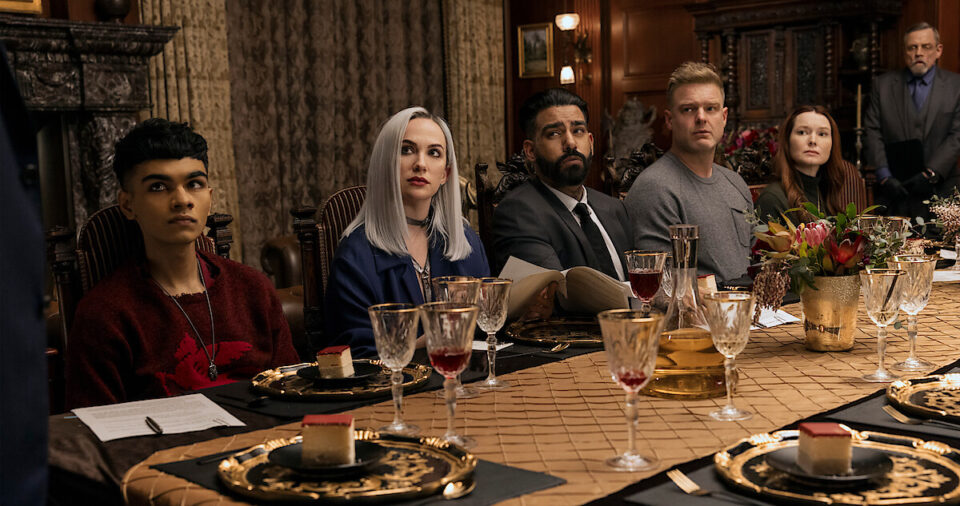
DC: I’m curious about the balance between the gothic Poe aesthetic and the wealthy, modern aesthetic of this cast. How did you manage to still have references to Poe in there while also being true to these characters?
LK: That was definitely the biggest challenge. It was in The Midnight Club, too. There’s something about contrasting time periods where you have any kind of Victorian aesthetic — which in that show was the house and in Fall of the House of Usher is the Edgar Allan Poe side of it — with something modern.
Like you were mentioning in terms of uber-wealthy people, how do you, in that sort of more modern, clean line aesthetic, make that visually not feel at odds with the other half of the show? I always like to start with an overarching aesthetic and, usually, a color palette. If I can’t make it all the same in terms of shapes, then I’m basing it down to colors. That helps narrow me down.

What was really interesting with this one is I had all these thoughts, and I think it would have been my first meeting with Mike, or even in passing in the hallway at some point, and he said, “You know, one thing I want to do is I’m going to give each of the Usher children a color.” And I thought, “Oh, no. There goes my color theory.” Because I can’t limit myself if there’s every color in the rainbow in the family. If that was my way of being cohesive, how do I keep that cohesive feeling?
I worked closely with Michael Fimognari, and we talked a lot about the colors because he co-directed and was the cinematographer. We talked about how we could make everything cohesive if, all of a sudden, we’re adding every color under the sun. It came down to finding an overarching color story for the whole show.
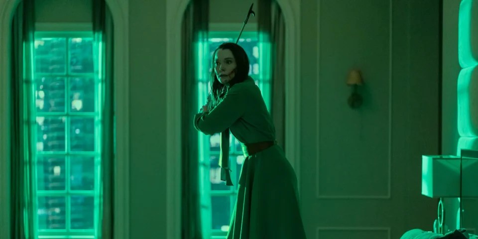
[The Usher family] all had very primary colors. We shifted everything into jewel tones, at least for the sets, and we let it shift a little more primary later. That helped us keep that jewel-tone antique color palette even in the modern scenes, and that was our basis for keeping that cohesive feel all the way through. Then when we got into the homes, it was like, okay, we have an emerald green for Tamerlane, so we’re going to lean into that as opposed to anything brighter. And then we’re going to subdue all of the paint tones, which also helps us tie some of the more modern spaces back to some of the more period spaces.
It really had a lot to do with the color in terms of making it feel cohesive and not cluttered.
DC: How did you go about choosing the colors for each person? I’ve seen some theories online about the seven deadly sins and that they might play into each character.
LK: I wish I had the answer! The colors came from Mike, so when Michael and I sat down, we already had, you know, Perry is red. But I always assumed it had a lot to do with the stories and the process of elimination — like, Perry was red because he was Masque of the Red Death, and Camille was silver because she was this very cold, ice queen, hard-lined kind of character.
I feel like Mike assigned the colors, and this is really just an assumption based on these qualities and then defaulted for the others based on what was left. For example, Frederick is supposed to be a mini-me of Roderick, and Roderick’s color was purple. I thought, well, he’s kind of a mimic of the purple because he’s blue.
So that’s what I thought Mike did, but I wouldn’t be surprised if there were more to it because he’s very thoughtful and careful about the details.

DC: This show is one of Flanagan’s goriest. How do you design a space while keeping in mind that blood will be splattered on it? How does that figure into how you’re going to design or pick the colors for a space?
LK: That’s everything, really. So much of the show is about how the children die, and that element takes place in all built sets. And they’re all very extravagant deaths, very elaborate. There’s a lot to them, not only with the functionality of the set to consider but also, like you said, with the gore.
I always work backward. So if I know what’s going to happen in the space, then I’m thinking about, “What’s the contrast going to look like with that? What kind of texture is that going to be in there for what’s going to happen when we actually apply the blood? Is going to show up? Is it going to stick?” I work back from the practicality of it, and then I give myself parameters for the design.
For example, Tamberlane’s death has gore, but it is a lot more about the breaking of the mirrors. So [it was about] figuring out where the mirrors would be placed and how to make them practical in this space. Why would she have them? What size are they? How do we break them and destroy the set in a way that’s reversible? We talked a lot about that when it came to the practicality of shooting and I was really lucky we had a great AD department.
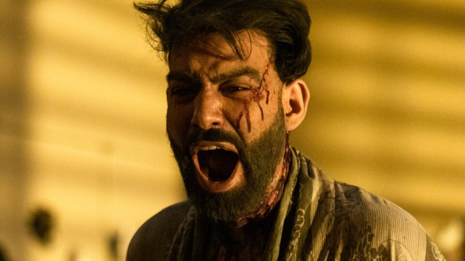
The assistant director scheduled [the shoot] in a way that we were shooting continuity in each space. For example, Leo’s apartment. We shot it clean, we shot it party, we shot it partially smashed and then we shot it fully smashed. We didn’t have to go from fully smashed back. But of course, the practicality of shooting is, “Well, he’s going to need to smash the wall more than once, so how many re-sets of a wall do we have?”
For Perry’s party, we shot him looking at the space when the party was first getting set up. Then we shot the party. Then we shot the… well, we called it “the cuddle-puddle.” And then we shot the aftermath of what that looked like and then we shot it cleaned out with Frederick demolishing the building. We couldn’t have gone from the Perry party back to a clean space. It would have been a rebuild in so many ways.
DC: Speaking of the warehouse, what was it like working on such a large set piece, which is such a dynamic and specific space in terms of story?
LK: That one was really challenging. I think we hoped for a long time, given that warehouses are not that hard to find, that we could shoot it on a location. The more delved into all the requirements that it needed to have, the more it was like, yeah, that doesn’t exist in a way where we could then put sprinklers in and get the whole thing wet and then put blood and gore all over it.
I think we all knew we had to build it pretty early on, but we were really hoping we wouldn’t because, of course, when you have a set budget, you want to prioritize the money and allocate it in a way that is going to be most apparent on camera. Like, “Do we really have to build a brick box? That’s so frustrating.” But it did work out really well. I drew a lot of versions of it. Once we had that, we could then integrate some of “The Masque of the Red Death” details, which I loved.
“The Masque of the Red Death” has a certain number of doors, and a lot of it takes place in a hallway and these rooms. We had the bedrooms that were meant to be our hallway rooms, and that’s where Death comes to visit Prospero in the original story. There’s also stained glass in the original story and specific colors, and we were able to do these big arched windows at the end that were a little reminiscent of stained glass because they were arched and a little more gothic. [With a built set], you have the creativity to be able to bring in some of those elements, whereas if we’d been in a location, we couldn’t have done that.
So that was the process. We built two bedrooms off one side and then a background hallway off the other. And then, obviously, that locker room off of the front. I wanted to keep it really long so it felt like that original hallway because most of the images of “The Masque of the Red Death” have Death in that hallway with a big arched window behind it. So that was where I started.
DC: The New Year’s Eve bar setting had the perfect mixture of cozy and sinister. What went into building that set?
LK: That was such a fun one to do, and I had lots of different ideas for that. I wanted it to feel quite cozy and intimate. However, we needed space for the dancing, and we needed to create distance between Roderick and Madeline when they were taking turns at the bar and having their time with Verna.
What I thought was really fun about that space was that it was kind of in the ether in that it was neither here nor there. It was Verna’s space. It didn’t really exist. It could have lots of Poe references in it. And ultimately, if you’re in a dingy bar in the ’70s, it was probably built fifty or a hundred years earlier. So I could lean into some brick and some gothic touches in an archway and really heavy wood detail, which is obviously a lot more in keeping with Poe.
Because so much time was spent at the bar, I really wanted to create a cool back bar. A lot of bars have mirrors behind the bar, but I thought what would be nice would be to do some stained glass so that you would get a glow behind Verna. So we leaned on our graphic designer, who designed all the stained glass to be based off of other Poe stories. So we did a black cat… we did the Raven, obviously. And then, when it came to set decoration, we had a photo of Edgar Allan Poe up on the top shelf, just amidst all sorts of bric-a-brac that was in there.
And then the other element was Verna. And she’s exactly what you said: she’s dark, but she’s also got morals in a way. They all have a reckoning in the end, and I think creating a space for her was fun because she’s very balanced in a way. The textured wallpaper was a very dark maroon, so it kind of tied in with Roderick, but it was not as specific as some of the other set colors. Over the door, we did more stained glass, and it has a V in it as if it says Verna above the door. But the gothic V looks a little bit like a U, so you’re not sure if it’s Usher’s or Verna’s.
Lots of details went into making it her space and, hopefully, feeling real enough that we believe it’s a real bar, and then once we’re out, we realize it’s not. We can believe it is a Verna creation, in a way.

DC: Let’s talk about the house of Usher. How did you go about separating it from the haunted houses of Mike Flanagan’s past while also honoring Poe’s history?
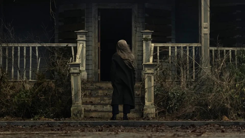
LK: On The Midnight Club, I was very worried because the house had a very big entryway, and it had a lot of similarities to Hill House or Bly Manor. The main goal was ‘how can I be different? What can I do that that’s different?’ But with Usher, I didn’t really worry because his childhood home is scripted as a 1950s suburban home.
[The house] is down the street from Longfellow. It’s a single-parent working household in the ’50s, so there’s not much money to go around. But then, also, it’s “the house of Usher,’ and in the original story, it’s a big mansion. It’s extremely gothic. It’s up on a hill. It’s very ominous. I had to take both of those pieces and meld them together, and it never actually crossed my mind that it would look like anything else because, to me, I hadn’t seen something that small and that detailed be a haunted house. It’s always something so grand in those type of films and series. I was more worried about melding those two styles together and finding something that was fitting for the family and created all the opportunities in the present day for the ghosts of the Ushers. I mean, Mike’s really big on realism and naturalism and making sure everything feels really authentic.
So for me it was… okay, Eliza’s a secretary. Maybe Longfellow slipped her some money to keep her close or to at least set her up a little. He doesn’t really feel like a generous guy, so she might have had to just get the home on her own. So what would she have? What would she rent or buy? And I thought, in the ’50s, she doesn’t have a 1950s home. She would have an 1890s house because, at that time, that was just old. So I thought, okay, it’s built in the 1890s but it can’t be super ornate, so where’s the balance? Gothic details on the fireplace would work. But in terms of the scale of the room or the height of the ceilings, it’s nothing. It’s just a suburban home in most sense of the word.
That was the process for that home and then, obviously, being able to transition it through all the different time periods (the ’50s, the ’60s, and then present day) and then define what those looks would be and come up with something in the beginning that could feel welcoming and homey and like it’s full of hope, to something that turns into chaos when Mom starts to fall apart to pure decay at the end. What opportunities can I create in the ’50s that will work in the present day for making it that?
DC: Are there any other Poe references that fans should look out for? Even if they’re references to other Flanagan universe shows?
LK: Yeah, I mean, there’s two layers of Easter eggs, or references, and one is exactly what you said. It’s the Flanaverse references, and I love that Mike layers those in. So the Oculus mirror’s one. And the Ouija board was in Madeline’s bedroom. And then, depending on the show and what’s appropriate, we’ll bring in books that reference his next project or previous projects, but only if it’s authentic for the time periods.
And then the other side of it is all the Poe references. And I think Mike did a really brilliant job of having a lot of Poe in the script, to begin with, and a lot of the stories really well represented. So what I tried to do was layer in little nods to Poe and to the respective stories in each episode. There are little things that fans can look out for, like the house number on the house of Usher is the year that Poe died, I believe. We did Poe references in a lot of numbers and things that are small in detail. And then larger references would be more obscure and that’s like the shape of the architecture, like Tamerlane’s arches and the way that the mirrors are and things like that that tie back to different stories.
DC: About the gravestones at the end… I’m curious what your thought process was when designing those because it’s always such a personal choice. I imagined that Madeline and Roderick had that planned out ahead of time.
LK: The gravestones were actually a really big challenge. Originally, the funerals were actually at the cemetery. And there was this big monument, the Usher monument, and it looked way older than everything else. And the reason for that is his Mom was buried there. So we had an older Eliza gravestone, then we had Roderick and Madeline.
What originally had taken place was designing a monument that looked like it had been put up maybe in the ’60s or ’70s when [Roderick] started to have little bit of money and he was able to give her a proper burial. And then, when the kids start dying, they have a set design, and it needed to be sleek and dark and kind of gothic, so the lettering is very gothic. [Roderick] knows that he’s going to die; he assumes he’s going to, so he has decided on consistency amongst all of the gravestones.
But [the gravestones] were really challenging because of our timeline and the fact they’re all built of foam. We actually had two sets of gravestones because the first just didn’t come out looking great. The type of foam that got used was just not high quality enough. So we actually built a second set and re-shot the gravestones because they just didn’t look high-end enough for the Ushers.
DC: I imagine you also had to have enough space on the top of the gravestones because there’s stuff being placed on top of it, right?
LK: That was really tricky, too. Because at the time, it was like, well, the arch of the stones is very gothic, so they have this very subtle arch, and it was like, “Okay, how much arch can we make and still balance a phone, or the blue sapphires and things like that?” It was very challenging to come up with something that looked pretty that was going to work for that. I think in the end, it worked, and they placed them very carefully.
Categorized: Interviews News
