‘Malum’ Cinematographer Sean McDaniel on Creating Claustrophobia

In 2014, Anthony DiBlasi’s Last Shift premiered at the London Film Festival and became the most talked about indie feature of the season. A year after the premiere, the film found its way to streaming platforms. There, it quickly reached cult classic status, while garnering a Rotten Tomato score of 100%. Almost ten years later, DiBlasi and Welcome Villian have released the reimagining titled Malum, and it’s sure to not disappoint fans of the original.
When discussing the film, Dan Clifton, producer of Malum and Head of Production for Welcome Villain says, “From day one, the goal was always to produce something that paid homage to the original but broke new ground in a much bigger way, making it feel less like a remake and more like a reimagining. From a scale and scope perspective, this film is a much meaner, larger beast.”
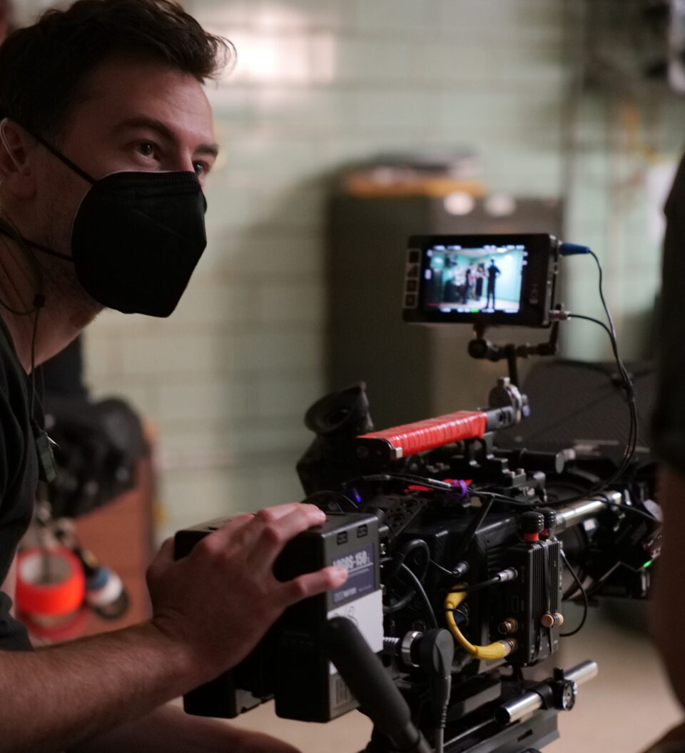
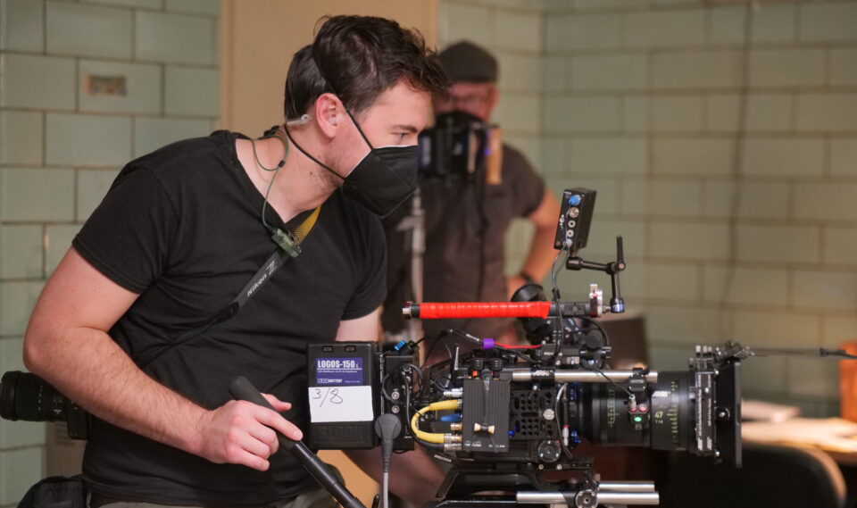
Dread Central spoke to the film’s cinematographer Sean McDaniel, who describes the look of the film as both naturalistic and gothic. Being a fan of the original, he couldn’t wait to expand the lens on what was already created in the 2014 version. In the below interview, Sean talks about all this and much more.

Dread Central: How did you become involved with Malum?
Sean McDaniel: I met Anthony DiBlasi, the director of Malum, a few years back through another project that he helped produce and that I shot. I could tell from that project he was a great collaborator and reached out about working together on his next film, which ended up being Malum.
DC: What did pre-production look like for you on Malum?
SM: We shot the film in Louisville, Kentucky last summer. I joined Anthony and the other keys out there about three weeks before production started. I really like all the prep time I can get. It’s such a crucial time for talking with the director and art department about the look and then figuring out how we’re actually going to achieve it. We shot a large part of this film in a real decommissioned police station, so I spent a good amount of prep time there with the team. As we all talked through the script standing in the actual place we were able to come up with new ideas tailored to the location. So Anthony and Scott would rewrite some of the scenes to really take advantage of what the station offered.
DC: Malum is a reimagining of Anthony DiBlasi’s hit film Last Shift. Were you familiar with that film when you signed on to Malum?
SM: Yes, I was a fan of Last Shift. I rewatched it a few times when Anthony told me that he was working on a reimagining. So I was very curious to read what Anthony and Scott would expand on and really enjoyed the direction this new script took things. I think fans will appreciate how this one really dives into more of the world that was only teased before.
DC: What were Anthony’s notes to you on how different he wanted Malum to be from Last Shift?
SM: We didn’t really discuss the movie in relation to Last Shift too much. While the premise is the same, Malum already in the script phase felt like a different movie. I think the main similarity visually is leaning into the practical location and embracing what it offered. In the first movie, they had a very uniform building and went with a more high-key and desaturated look that works really well for that station. Our station was a lot larger with a variety of looks that allowed us to embrace color and shadow more. This film has a strong investigation element that creates a character who is more proactive than responsive. Our camera movement matches that quality.

DC: How would you describe the cinematography of Malum?
SM: The film has a naturalistic look that takes a grimy Gothic turn.
DC: Lighting seems to play a very important part in the film, with flashlights sometimes being the only thing lighting scenes. Can you talk about the film’s lighting? Did you lean towards certain hues?
SM: The lighting package we put together for this film was definitely an odd one for me. So much of the film is in the police station at night and almost all of the locations within the station are windowless. The normal thought would be to have your practicals inside and then have streetlight or moonlight come in through the windows to augment. But we didn’t have that option. Ultimately, it gives the movie a very claustrophobic feeling that works really well. But that meant that the majority of the film is lit from overhead with fluorescent fixtures.
Our lighting team would go ahead of us and remove the actual fluorescent lights and put in LED tubes that we could control wirelessly. This was crucial not only for the look, but for scheduling as well. We set different color shifts for each location within the station to match the mood we wanted and also for visual clarity to the audience. We are returning to some of these spots a few times and having a color cast to the light that is memorable, even if you only remember it subconsciously helps ground the viewer.
The flashlight is like another character in the movie as it plays so frequently. We tested a few flashlights and ultimately picked the one that had the narrowest beam. I knew we were going to be in tight spaces and didn’t want to be lighting up the entire room. The narrow beam kept things darker in general and let us limit what’s actually illuminated in the shot, keeping the tension up. A lot of the flashlight moments are also augmented by other small subtle lights hidden around the set or following the actor, but those were kept very dim so that you don’t actually notice them.
DC: Was there a particular shot that was harder to film than others?
SM: There isn’t a particular shot that comes to mind. But, there are a few scenes in which a character is in spaces with no light whatsoever. And that’s definitely a challenge. It’s quite subjective as to what a viewer should or shouldn’t be able to see when a character is in a totally dark room. I like where we landed, but any “no light” look is always a challenge.
DC: The police station set in the film was actually shot in an abandoned prison in Kentucky. Did anything scary happen while on location?
SM: The location definitely had some creepy spaces. I never had anything scary happen to me while I was there, but two things do stand out. There was one elevator that had shoe prints on the ceiling which was a little unsettling. As if someone had walked upside down across it.
There was also one instance where we were shooting in a long hallway and I was at the opposite end of where a light had been hidden in a small room. At one point I noticed that the light in the room was suddenly off. I’d been there the whole time and no one else went into that room, which had only one entrance. I figured a bulb had blown. But when a crew member went in to check, the light had been switched off. This was an old tungsten light, which meant the switch had to be flipped. Like I said, no one else had gone into that room…
DC: What are the pros and cons of shooting in an abandoned prison?
SM: The location felt almost like being on a set. Because we were shooting in areas without windows and had full control of the space it really had that same vibe, but we had the benefit of it all being real. Also, we were working mostly with lightweight LED units and a police station/prison has a lot of metal around. So when my gaffer Kyle Reid started throwing magnets on all our units, suddenly the entire station became an option to stick a light. It was some of the smoothest rigging we could have asked for.
The only con was having to look at those shoe prints on the elevator ceiling, wondering how they got there.
DC: Is there anything you would like to tell us about the cinematography of Malum that audiences might not know or realize?
SM: I don’t want to say too much before people see it. Hopefully, all of these things are invisible to the viewer and you’re just pulled into this crazy ride of a movie.
Malum is out now in theaters.
Categorized:Interviews News

